Commissions from Destruction Arts
With commissioned work it’s so important to understand and develop the narrative of the person that the artwork is to be created for. I have provided a number of examples of commissions so you can begin to understand the processes involved and see how each project unfolds. I hope you enjoy hearing from me and my customers.
The buildings of my life
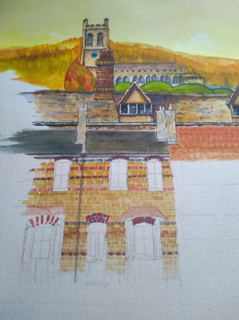
When I interviewed Liz she wanted a piece that encapsulated her entire life focusing on the places she had called her home and buildings that held special memories. Having seen examples of my paintings she had done quite a bit of homework before we met by digging through old photos of her childhood and adult years, thinking about who all the important people and pets were and capturing images from Google Streetview of places where no photos existed. I remember Liz remarking that although people might take photos of themselves inside their home or garden or standing at their front door there were rarely shots of the whole front of their house. And I think she has a good point.
There were some lovely memories that we talked through in our meetings. Liz loved her Dad and one memory was of him walking their Pekingese dog (a fluffy hound called Mr Puff). As both Dad and dog began to advance in age Liz’s Dad began carrying the dog to the park in a hold-all after he refused to walk the full distance. It must have been quite a sight if you bumped into them!
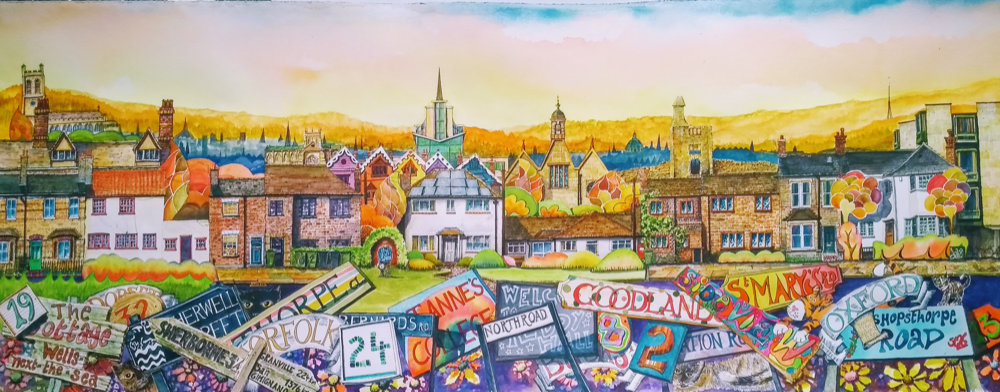
Liz has an interest in typography and was keen to represent street names and house numbers in the painting and these are all jumbled up in the foreground and I understand she likes to ask close friends who have known her for a long time if they can remember what house numbers go with each street name! The various counties where Liz lived are all represented in the font and style of Matthew Rice as she particularly likes his fun architectural books. The buildings include the houses where she has lived, her grandparents’ house and a cottage belonging to a friend where she spent all her childhood summer holidays.
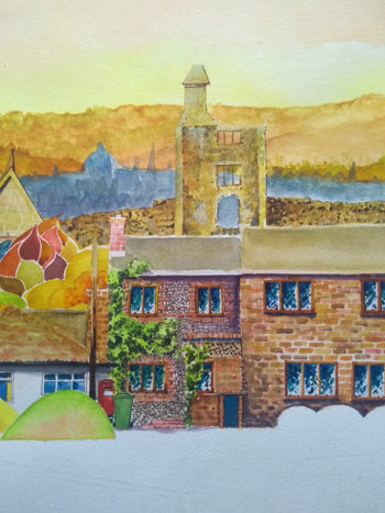
Liz’s favourite season is autumn and she wanted all the beautiful colours of this season captured in the scene. There are lots of references to Oxford including the hills in the background, the Radcliffe Camera and Oxford University where Liz studied. Oxford buildings include the Gatehouse at St Anne’s College (demolished in 2014 and replaced by a Library and Academic Centre)complete with bicycles, St Edmund Hall and the chapel where Liz sang in the choir. The Seacourt Tower (nicknamed ironically by locals as the ‘Botley Cathedral’) sits proudly in the centre of the painting and was designed by Liz’s great uncle.
From a personal point of view I’m very pleased with the outcome of this painting. References abound both literal and figurative to many important parts of Liz’s life that fully capture her story. Liz was a great collaborator in the design process which ensured that I was making informed choices for her painting whilst allowing me to express my creativity and quirks that Liz liked about my style. The linking together of each home and achieving the right kind of scale and proportions took quite a lot of thought. The colours in some parts are somewhat muted compared to my usual palette but the golden oranges, yellows and browns are all nicely balanced and the painting looks all the richer for it and fits in with the many, more traditional, paintings that line the walls of Liz’s cottage. The signs and gardens provide splashes of colour that really lift the foreground. I’m incredibly pleased with the results and so is Liz.
This project was a huge undertaking that required lots of research over several months, planning, design thinking, unusual juxtapositions, lots of attention to detail and concentration. It’s a big piece and there was a lot of paper to fill. As with many of my paintings some sections could be cropped from the full image and each would stand up as a small painting in its own right. Technically I love the diversity in this piece. The background sky and hills are quite traditional in terms of watercolour technique, the illustrative nature of the cats and cartoon tigers (from Liz’s study) were fun to do. The stylised approach to the trees and gardens are very much Dazzler18 and the signs and numbering have a really colourful impact. I learned so much from doing this painting and was totally invested in the process from start to finish. Love it.
Forever Home
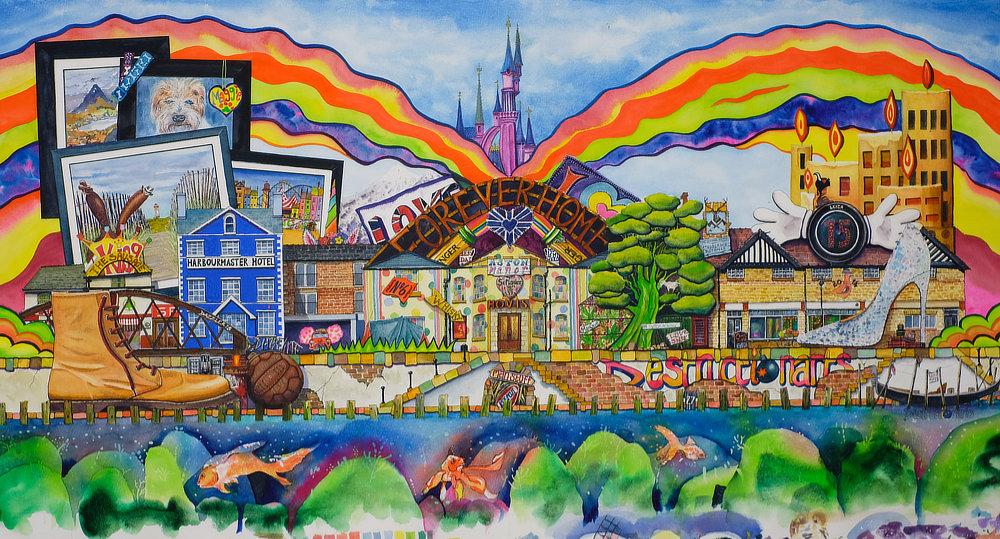
Forever home is pure Dazzler18. This was an unusual project as I’d never actually met or spoken to the family for whom it was intended until I delivered the painting. Instead I worked from a written brief to help me develop a narrative.
The centrepiece depicts the family’s beautiful home, a home that has needed lots of tender loving care since they first bought it. Over time they have brought it back to life. It’s a home that they don’t intend to leave - their ‘forever home’. It combines their previous lives in the city and their new lives on the doorstep of beautiful North Wales. Also featured is Simon and Claire’s boutique Trilby Pheasant which also houses Simon’s gallery, Gallery Fifteen. These are where town and country merge, all with an extravagant flourish. As one might expect there are a number of trilby and pheasant Easter eggs to spot! The painting reflects both Simon and Claire’s personalities. Simon’s love of photography, aquaria, the great outdoors, walking and trips across Scandinavia for those perfect shots; and Claire's love of sophistication, quality, boutique styling (and obviously who doesn’t love a bit of Christian Louboutin?), family holidays and pets.
There were lots of challenges to address in this painting The Louboutin shoe had these incredibly complex, mirror-like snakeskin scales that threw out a range of different mesmerising colours, beautiful to look at on a photo but so difficult to capture with watercolour. The aquarium scene involved some nice negative space painting and the dreaded masking fluid so the coral and flora could emerge from the background. I really enjoyed painting the old Casey football and the Sleeping Beauty castle was surprisingly satisfying to complete with its golden finishes. This painting was very large for a watercolour requiring specialist extra large paper - almost twice full imperial if I recall correctly. Always a bit scary to work on if you make a big mistake. It took a long time to complete given the complexity of both the unusual approach of not previously meeting Simon and Claire and the design itself, which required quite a bit of thinking through before the first lick of paint was even applied. Nevertheless I think the end result is stunning, has incredible visual impact and I know that Claire and Simon were very pleased with it and how well how it has captured their story.
The Scarecrow Festival
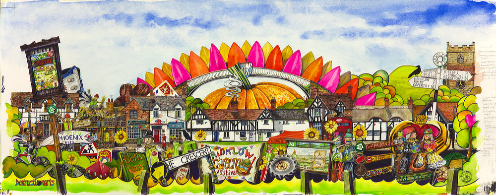
Christine’s project was a colourful challenge to undertake. Over the course of my interviews with Christine it was apparent how much she had loved living in the village of Brinklow. Brinklow has a strong historical heritage and perhaps its key feature is the grassy 12 metre high Tump a short walk from the village centre. A Tump, for those unfamiliar with the word, is a small mounded hill which, in Brinklow’s case, was the site of Brinklow Castle, a Norman motte and bailey construction which possibly once stood on an ancient megalithic burial barrow. Brinklow was on a well-connected canal route between Rugby and Coventry and although many of the less used waterways have been abandoned over time there is still a boatyard close by called Rose Narrowboats which apparently repainted the Ragdoll narrowboat famous for the 1990s children’s TV programme Rosie and Jim.
Village life was Christine’s main inspiration for her painting and there are many personal and village references included. A major theme for Christine was the annual Brinklow Scarecrow Festival. Every summer the local residents and businesses transform the village with impressive homemade displays of fun scarecrow creations. The standard is incredibly high and there is a strong competitive element to see who can come up with the best scarecrow each year. I remember seeing an astronaut and a lunar lander in someone’s garden one year - brilliant!
To the left is the “naughty” side of the village, with a pub combination of The Raven and The White Lion with the distinctive Bull’s Head sign to complete the set of Brinklow pub references. Here we also have the naughty Brinklow frackers causing a great deal of consternation for local NIMBYs (Christine has a vivid imagination). To the right is the “nice” side of the village with the 13th century St John the Baptist Church and the Community Hall.
Brinklow has many beautiful houses and Christine wanted the piece to depict all her favourites including the pretty thatched cottages and newer properties. Pumpkins Deli (which sells great coffee apparently) and the Post Office shop also feature. The centrepiece and heart of the painting are a beautiful row of black timber-framed white-washed cottages that form part of The Crescent. And I don’t mind saying Christine... What a statement painting you have! Absolutely stunning!
So you definitely like my style? Fab!
Why not ask me about commissions, with a range of subject options and prices to suit your pocket.
Want something extra special? Then you’ll want The Works.
The Works involves:
- Two interviews with you to understand all those extra special things in your life that you would like integrated into your bespoke painting. This can be a face to face interview or by FaceTime/Skype, whatever you prefer
- The first interview will be detailed during which I’ll get to know you (and/or the person or people the painting is for) and the key events in your life and the meaningful stories that are important to you. I take notes and review these with you at the end to make sure I have understood everything correctly. We will agree a relevant setting or theme that you are happy with, for example, your home or a holiday theme and you can see a portfolio of some of the previous work I have completed for inspiration and to help you to see what things I can do. I will also give you a rough idea of prices. At this point if you wish to go ahead I will take a non-refundable deposit of £50
- Then I begin the design process which involves a rough sketch and text notes. We then meet again for a second interview to review the sketch design, decide on some of the relevant details, features and key colours as well as the size of the paper. We can look through the portfolio again to finalise and detail your main choices. If you have photos that you are happy to share, they would be very useful
- At this point we can agree and record a final price. I will usually draw out the full size outline design which I will then message to you
- Throughout the painting process I will send you updates on the various stages so you can see how the painting is unfolding
Depending on how far into the painting process I am it may be possible to include additional work or make minor changes if required. I will let you know how much this will cost and we can review the price accordingly.
Timescales can vary but I will give you an estimation of lead time from the point of agreeing the final design. If you need the painting for a special date of significance please let me know at the outset. You will no doubt want your painting framed and you need to take into account your framer’s timescales too. If you want to arrange framing through me I can do this too.
Alternatively you may prefer something simpler or perhaps a print. Just ask for details.
Please do get in touch with me if you have any questions.
Dazzler18
